
Iconic racing liveries: when colour became part of the machine
A racing livery usually begins with a practical purpose.
To identify a country.
A team.
A sponsor.
But every so often, something more unusual happens.
The sponsor leaves. The car becomes obsolete. The championship moves on. Decades pass.
And the colours remain.
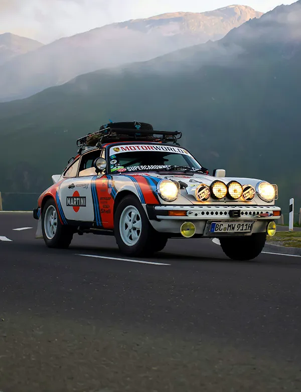
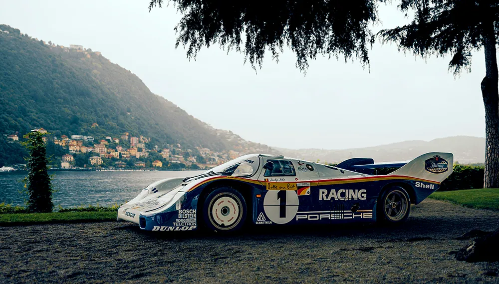
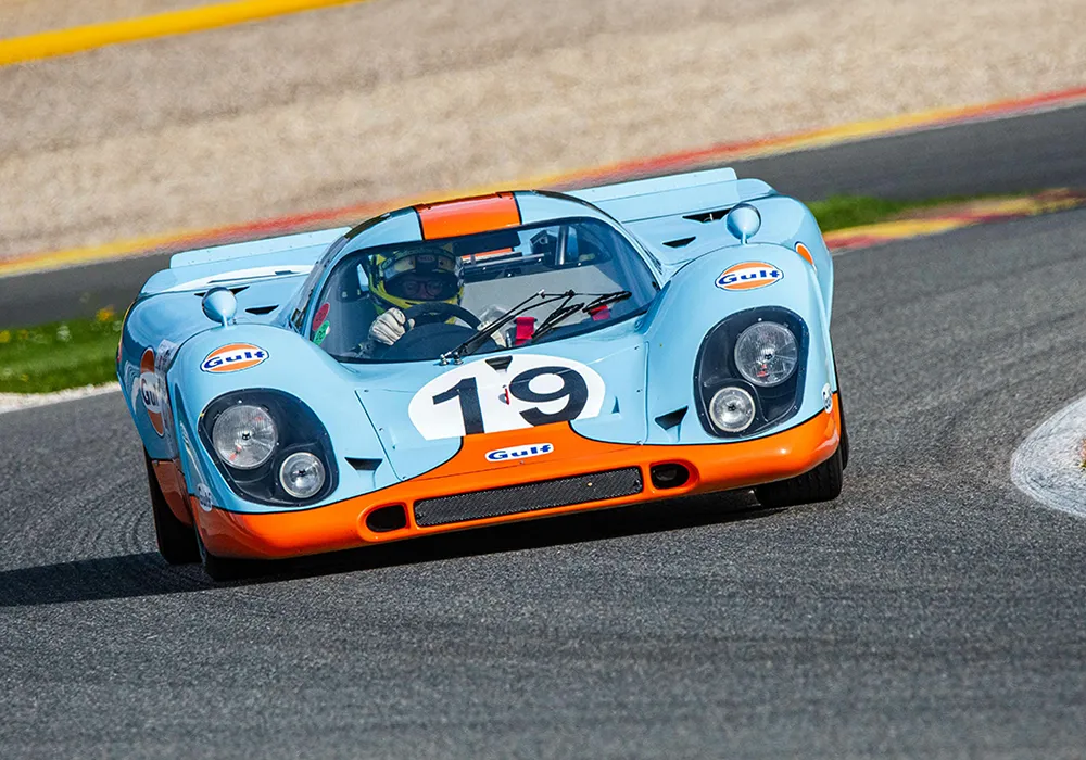
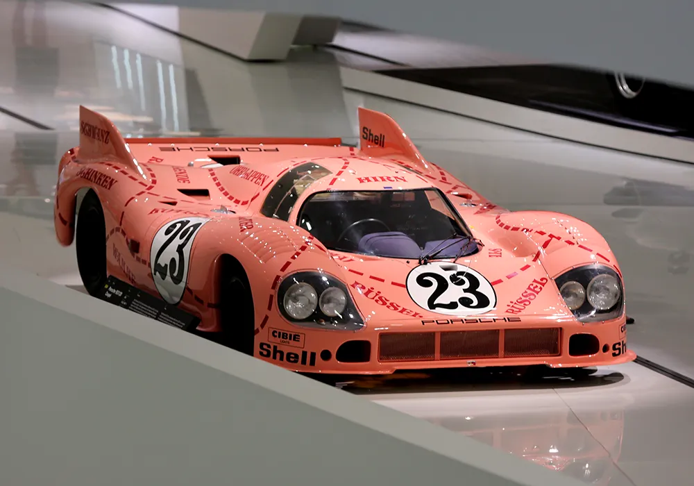
Gulf blue and orange. Martini stripes. Rothmans white and blue. Black edged in gold. A pink Porsche divided into cuts of meat.
At that point, they are no longer simply liveries.
They have become memory.
And few forms of graphic design have ever had to work harder for it.
Before sponsors owned the colour
For much of motor racing’s early history, colour was linked more closely to nationality than to commercial identity.
British entries became associated with green. Italian cars with red. French cars with blue. German machinery traditionally appeared in white, with silver becoming inseparable from its racing identity during the pre-war era.
It was a system of identification before it was a system of branding.
Commercial relationships certainly existed, particularly with companies connected to fuel, tyres and other parts of the automotive industry. But the surface of the car itself was not yet the commercial territory it would later become.
That began to change decisively in Formula 1 in 1968.
Restrictions on non-automotive sponsorship were relaxed just as the cost of competing was rising. At the South African Grand Prix, the privately entered Team Gunston Brabhams appeared in the colours of a cigarette brand.
One race later, in Spain, Colin Chapman’s works Lotus team replaced its familiar green and yellow with the red, white and gold of Gold Leaf.
That distinction matters.
Lotus was not the first racing car ever to carry commercial sponsorship, nor even the first Formula 1 car that season to be painted entirely for a sponsor.
What Chapman understood exceptionally well was the scale of the opportunity.
The sponsor did not need to occupy a panel.
It could occupy the whole car.
The racing machine was becoming a moving visual identity.
When the car became media
The timing was not accidental.
Motor racing was becoming increasingly visible on television at exactly the moment tobacco advertising faced growing restrictions in conventional broadcast media.
For cigarette companies in particular, motorsport offered an extraordinary loophole: paint the brand onto the car and television cameras would carry it around the world.
That financial relationship would eventually become one of the defining, and most controversial, forces in international motorsport.
But it also changed racing visually.
The traditional national palette began to disappear.
In its place came something much more aggressive: colours designed not simply to distinguish one machine from another, but to be recognised instantly at speed, from a distance and through a television screen.
Some worked.
A handful became immortal.
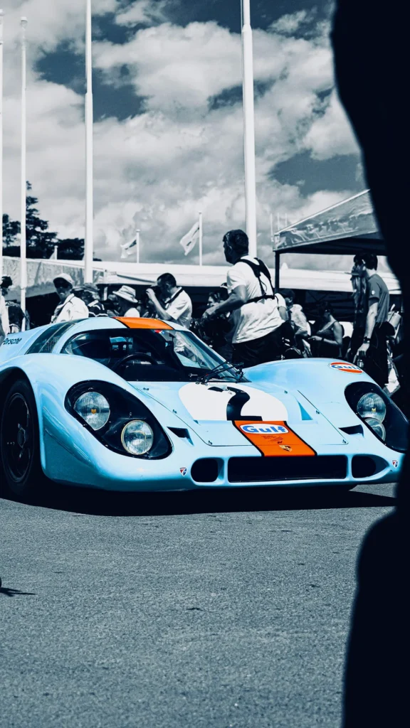
Gulf: when the result matters less than the memory
Light blue and orange should not work particularly hard.
There is no elaborate graphic system.
No complex pattern.
No obvious association with speed.
Yet together they became one of the most recognisable combinations in motorsport.
The story is more specific than the mythology often suggests.
Gulf’s corporate colours were originally a darker blue and orange. When the company expanded its racing programme with John Wyer’s operation in the late 1960s, the darker blue was considered too subdued for competition.
The solution came from Wilshire Oil, a company Gulf had recently acquired.
Its powder blue, combined with Gulf orange, produced something far more visible.
And, eventually, far more valuable.
The Gulf-JW Automotive relationship carried those colours across Ford GT40s, Porsche 917s and Mirage prototypes. The GT40 won Le Mans for Gulf in 1968 and 1969. Mirage would do it again in 1975.
The Gulf Porsche 917 never did.
That is worth stopping on.
Because if cultural memory followed sporting results alone, Gulf would not be the colour in which so many people instinctively picture the 917.
Porsche won Le Mans for the first time in 1970 with the red-and-white Salzburg 917 KH.
In 1971, the winning 917 belonged to Martini Racing.
A Gulf 917 finished second.
And yet Gulf and the 917 became almost inseparable in the imagination.
Part of the explanation is John Wyer.
Part is the success the cars achieved elsewhere.
And part is cinema.
Steve McQueen’s Le Mans gave the blue-and-orange 917 a cultural life beyond the championship it had been built to contest. Motorsport imagery became cinema imagery, and cinema turned a racing colour scheme into something much larger.
The interesting thing today is how little of the original branding is required.
Remove the Gulf lettering.
Leave the blue and orange.
Most people who know endurance racing will still complete the image themselves.
That is the point at which a livery stops needing its logo.
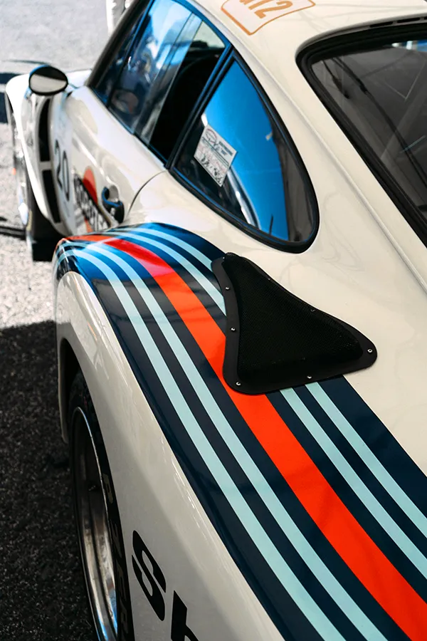
Martini Racing: identity through movement
Martini works differently.
Gulf is remembered largely through blocks of colour.
Martini is remembered through a line.
Or rather, several of them.
Dark blue. Light blue. Red.
The stripes move across the car with enough visual rhythm that they imply speed even when the machine is standing still.
Martini Racing was formally established in 1968, initially with a focus on endurance racing, and its relationship with Porsche began almost immediately.
By 1971 that partnership had produced one of the defining victories in Porsche history.
Helmut Marko and Gijs van Lennep won the 24 Hours of Le Mans in a Martini Racing Porsche 917 KH, covering 5,335 kilometres.
The distance record stood for 39 years.
Martini would go on to appear across very different forms of motorsport and very different machinery: Porsche sports cars, Lancia rally cars, Brabham Formula 1 cars and many others.
That adaptability is part of what made the identity so powerful.
The stripes did not belong to one shape.
They could be compressed, stretched, curved or redirected around whatever surface they occupied without losing themselves.
On a racing car, this is not a trivial achievement.
A bonnet, a wheel arch and a rear wing do not behave like a sheet of paper.
Good liveries understand the object beneath them.
Great ones use it.
Martini became one of those rare graphic systems capable of moving from machine to machine while remaining immediately recognisable.
It did not simply sit on the bodywork.
It travelled through it.
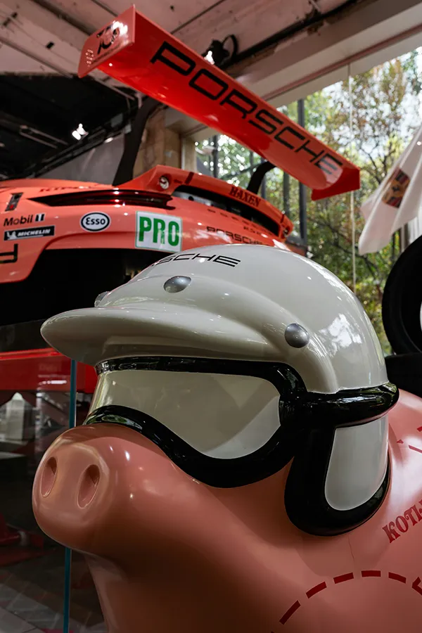
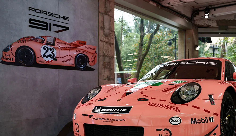
Pink Pig: the icon that wasn’t supposed to be elegant
The Porsche 917/20 presents almost the opposite case.
There was no elegant graphic system waiting to be applied.
There was an engineering experiment.
Porsche and the French company SERA were attempting to combine advantages of the short- and long-tail versions of the 917. The result was an unusually wide body with deeply recessed wheels and exaggerated, rounded forms.
It looked strange.
Strange enough to acquire porcine comparisons before it acquired its famous colour.
According to Porsche’s own account of the story, Count Rossi of Martini & Rossi was less than enthusiastic about the new body and did not want it dressed in the company’s familiar racing stripes.
What followed was one of Porsche’s most unexpected acts of visual self-awareness.
Anatole Lapine, then head of design, covered the car in pink and divided its body into sections resembling a butcher’s diagram.
Ham. Loin. Shoulder. Snout.
The engineering prototype had become the joke.
But the joke was extraordinarily well designed.
The lines acknowledged the shape rather than disguising it. What conventional racing graphics might have tried to make slimmer or faster, the Pink Pig exaggerated.
Its width became the idea.
The 917/20 did not win Le Mans in 1971.
It was running fifth before retiring after an accident.
That failure makes its afterlife more interesting, not less.
Hundreds of successful racing cars have disappeared almost completely from visual memory.
The Pink Pig did not.
In 2018 Porsche returned to the idea for Le Mans, applying a contemporary interpretation to a factory 911 RSR.
This time, the story ended differently.
The #92 of Kévin Estre, Michael Christensen and Laurens Vanthoor won GTE-Pro.
Forty-seven years separated the two cars.
The graphic idea needed no explanation.
Rothmans: an identity attached to dominance
If Pink Pig became famous despite its result, Rothmans became inseparable from results.
Its association with Porsche arrived at precisely the right moment.
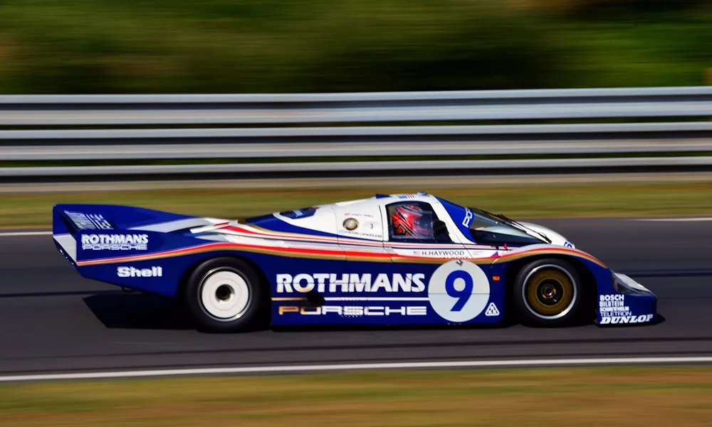
Group C. 1982. The Porsche 956.
White and dark blue, divided by restrained red and gold lines.
Compared with Pink Pig, almost austere.
Compared with many racing liveries of the period, remarkably controlled.
Then came Le Mans.
The three works Porsche 956s finished first, second and third in 1982.
The nearest challenger was 30 laps behind.
A year later Porsche returned with another one-two.
The 956 evolved into the 962C, and the visual identity continued. Rothmans-liveried 962Cs won Le Mans outright again in 1986 and 1987.
That sequence matters because visual memory is built through repetition.
The same colours. The same circuits. The same front-running cars.
Again and again.
Eventually, the relationship becomes automatic.
See Gulf and a 917 may come to mind.
See Rothmans colours and the mind tends to go somewhere else:
a 956 or 962 sitting almost impossibly low over the asphalt, deep into the Group C era.
One livery recalls a car.
Another recalls a period.
Porsche Salzburg and the Hippie: proof that there was never one formula
It would be tempting to conclude that great racing liveries require sophisticated commercial identities.
Porsche itself disproved that.
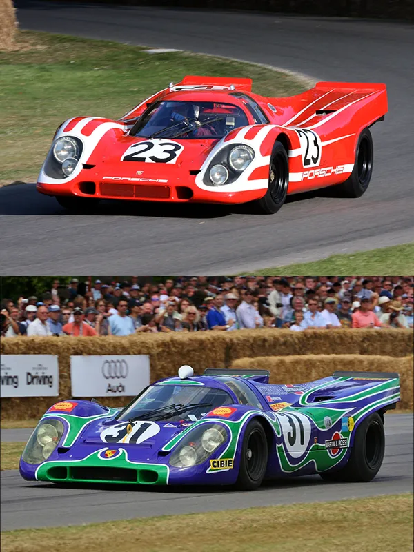
At Le Mans in 1970, the Porsche Salzburg 917 KH that gave the company its first overall victory was red and white.
Direct.
Almost severe.
Another Porsche at the same race went in precisely the opposite direction.
The long-tail 917 later known as the Hippie wore sweeping psychedelic forms across its body, created under Anatole Lapine’s design leadership.
It finished second.
One 917 was disciplined.
The other exuberant.
One relied on blocks of national colour.
The other looked as though the late 1960s had been poured over the bodywork.
Both survive in Porsche’s visual memory.
Which is useful, because it kills the idea that there is a formula.
There isn’t.
What the lasting liveries share is not a style.
It is distinctiveness.
Beyond Porsche: black, gold and the Lotus 72
Porsche was hardly alone.
Perhaps the clearest demonstration of how far commercial identity could reshape a racing car came from the same team that had helped accelerate the sponsorship revolution in 1968.
Lotus.
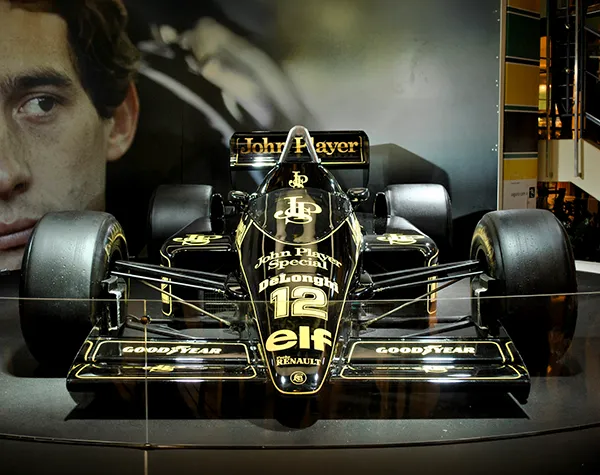
By the 1972 Formula 1 season, the Type 72 was no longer red, white and gold.
It was black.
Gold pinstriping followed the edges of the bodywork. Logos were controlled rather than scattered. Even many secondary graphic elements submitted to the palette.
John Player Special had turned a Formula 1 car into a piece of packaging at racing scale.
That sounds like criticism.
It isn’t.
From a design perspective, the discipline is precisely why it worked.
The Lotus 72 already had one of Formula 1’s most radical forms: a low wedge, side-mounted radiators and a profile fundamentally different from the cigar-shaped cars that had preceded it.
Black made those surfaces harder.
Gold described them.
And success fixed the image in memory.
Emerson Fittipaldi became World Champion in 1972, with Lotus also taking the Constructors’ title.
The cigarette packet and the racing car had effectively become the same visual object.
Decades after the commercial relationship disappeared, black and gold still needs remarkably little context to suggest Lotus.
The advertising expired.
The design did not.
McLaren: the power of seeing the same thing for twenty years
Some visual identities become memorable because they are exceptional.
Others because they are repeated until they become part of the landscape.
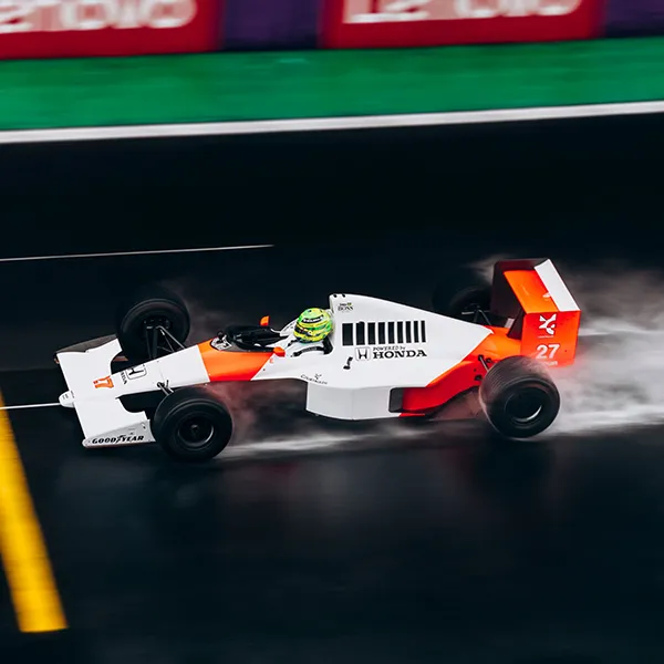
McLaren’s red-and-white era belongs to the second category.
The Texaco-Marlboro partnership transformed the M23 for 1974, the same year Emerson Fittipaldi delivered McLaren its first Formula 1 Drivers’ Championship.
James Hunt followed in 1976.
Later came Prost.
Lauda.
Senna.
Different cars. Different technologies. Different decades.
The underlying red-and-white identity endured.
That continuity created something difficult to reproduce deliberately.
For an entire generation, those colours did not merely mean a sponsor.
They meant McLaren.
Which raises one of the stranger questions in racing identity:
when a sponsor remains long enough, who is borrowing whose visual language?
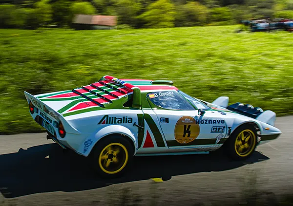
Alitalia and the Stratos: designing with the car, not over it
Then there is the Lancia Stratos.
A completely different discipline.
A completely different shape.
From 1975, the works Stratos carried Alitalia’s white, green and red identity.
What makes it particularly interesting is not simply the colour combination, but how the identity was adapted to the car.
The airline’s graphic motif was split and shaped into wedges that followed the Stratos’ own geometry.
That sounds obvious. It is not.
Poor liveries treat a racing car as advertising space.
They place graphics on top of a surface.
The Alitalia Stratos behaves differently.
The graphic and the architecture reinforce each other.
Marcello Gandini’s body was already angular, compact and visually aggressive. The livery did not attempt to soften it. It repeated its direction.
A wedge painted onto a wedge.
The Stratos had already won the 1974 World Rally Championship for Manufacturers before the Alitalia livery appeared.
It won again in 1975. And again in 1976.
By then, shape and graphic identity had become difficult to separate.
When advertising becomes culture
There is a certain irony in looking back at all of this.
Many of motorsport’s most carefully preserved visual identities began as temporary advertising.
Oil. Alcohol. Airlines. Tobacco.
The car was media.
The logo was there because somebody had paid for it to be there.
The intention was commercial and immediate.
But design does not always remain attached to its original purpose.
Sponsors disappear.
Companies change.
Advertising laws change.
The cars enter museums.
And sometimes the visual code becomes detached from all of them.
People who never watched Group C recognise Rothmans colours.
People born decades after the 917 stopped racing recognise Gulf.
Martini stripes can be identified without reading Martini.
The Pink Pig needs no logo at all.
That is not really advertising anymore.
It is visual memory.
How little can remain?
That leads to a more interesting question than which racing livery was the greatest.
How much can you remove before recognition disappears?
The sponsor name? Usually.
The race number? Certainly.
The car itself? Sometimes.
A particular blue beside a particular orange can already be enough.
Three stripes can be enough.
White, dark blue and a thin line of gold can be enough.
Pink intersected by butcher’s marks can certainly be enough.
The strongest liveries became visual codes because they learned to survive reduction.
And once a code reaches that point, it no longer needs to describe the original object in full.

From the racing car to the Fuchs
That idea became the starting point for our Racing Fuchs series.
Not to reproduce four racing cars.
And not to turn a wheel into miniature advertising.
The opposite.
To remove almost everything.
Gulf. Martini. Rothmans. Pink Pig.
Four histories reduced to colour, rhythm and one form that belongs unmistakably to Porsche.
The Fuchs.
If the reference still survives after everything else has disappeared, the livery has already done its job.
And perhaps that is the difference between a racing colour scheme and an icon.
One identifies the car.
The other remains after the car has gone.